

The digital diaries


Why Your Contact Form is Your Most Expensive Date

Let’s be honest, darling. You’re a high-value creative. 


Your time is finite, and your energy is precious. So why are you spending three hours a week weeding out unqualified leads from a generic contact form?

The simple answer is that most designers treat a contact form like a simple box to collect a name and email. I treat it like a velvet rope.


The Problem with “Hi”: Attracting Tire-Kickers

A generic contact form that just says “Hi, tell me about your project” is an open invitation for everyone—including the clients who don’t have a budget, timeline, or clear idea of what they want.

You spend time:

  • Reading lengthy, vague emails.

  • Drafting polite rejection responses.

  • Wasting emotional energy that should be poured into your actual craft.

Time spent on bad leads is not only wasted time; it is expensive time.

The Art of the Qualifying Question

The secret to luxury service is setting expectations and standards before the contract is signed. My templates solve the problem right at the gate with the Smart Qualifying Form.

We integrate specific, elegant questions that gently filter out the noise:

  • “What is your investment range for this project?” (If they skip, they’re likely not a fit.)

  • “When is your ideal project launch date?” (Filters out urgent or vague requests.)

  • “Which specific service are you most interested in?” (Forces clarity on their needs.)

The form is still aesthetically beautiful, but its function is ruthless. The luxury is the filter.

Beyond the Form: Conversion Architecture in Every Detail

My template design is all about elimination. We eliminate confusion, we eliminate friction, and we eliminate unqualified leads.

When you shop my template collection, you receive:

  • Flawless User Flow: A clear path designed to funnel the user from “Portfolio” to “Contact” with no hesitation.

  • Irresistible CTAs: Buttons that feel like the only logical next step to take.

  • Elegance in the Details: Even the error messages are polite and chic—because luxury never panics.


Ready to stop chasing everyone and start attracting the one?

Thee role of the designer is that of a good, thoughtful host anticipating the needs of his guests.”
Charles Eames

Follow me for more

Digital guides

The Website Mistake Happens Before the Website

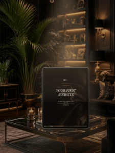
Most failed websites don’t fail on design — they fail because the strategic decisions were never made before the design started. YOUR FIRST WEBSITE fixes the order of operations: who the site is for, what action a visitor should take, and what needs to be said in the first ten seconds. A working document, not a design guide.

Read More »
dark editorial WordPress template
Brand & design

Why Your Portfolio Needs More Shadow: Introducing Chéri

Most creative websites default to white backgrounds and safe grids because that’s what “clean” is supposed to look like. Chéri does the opposite — using black as a design tool to give a single photograph the weight of a gallery wall. Built for photographers, models, and artists whose work already carries visual tension, not for anyone who needs convincing that less is more.

Read More »

Share to :

EXPLORE TEMPLATES ENGINEERED FOR HIGH-VALUE LEADS.