
Why Your portfolio

 needs more shadow: Introducing Chéri

Most creative websites are afraid of the dark. They default to white backgrounds and safe grid layouts because that is what every template markets to them as “clean.” Clean is not the same as memorable, and for a model, photographer, or artist, memorable is the entire job.

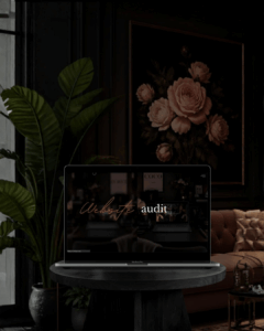
Chéri was built on the opposite instinct. It uses black as a design tool, not an absence of one — deep, editorial black that makes a single photograph feel like it belongs in a gallery rather than a scroll of thumbnails. This is the same restraint you see in the physical portfolios of luxury fashion houses and independent artist books: less on the page, more weight on what remains.

Who Chéri Is Actually For

This template is not for every creative business. It is for the person whose work already carries visual tension — a photographer shooting moody, contrast-heavy editorial sets, a model whose book leans toward high fashion rather than commercial catalogue work, an artist whose pieces need negative space to breathe. If your work is bright, colourful, and product-forward, Chéri will fight you. If your work is atmospheric, Chéri will finish the sentence your images started.

The Design Decisions Behind It

A few choices define the template beyond the colour palette:

  • Typography that behaves like a title card. Serif display type is used sparingly and at scale, so headlines feel closer to a film credit sequence than a website header.

  • Full-bleed image sections. Work is shown at a size that respects it — no cropped thumbnails competing for attention.

  • Restrained navigation. The interface gets out of the way. Visitors should remember the work, not the menu.

  • Built on Elementor, so every section is editable without needing a developer for routine updates — swapping images, adjusting copy, and adding new work stays within your control.

What This Solves for You

The real problem Chéri addresses is not aesthetic — it is credibility. Clients and casting directors form an opinion about your professionalism within seconds of a page loading. A generic template, however well the photos are shot, quietly signals “I have not invested in how I present myself.” A considered, editorial site does the opposite work before you have said a single word in a meeting.

If you have been putting off replacing a template that “does the job,” this is the sign to stop settling for functional and start using your website as the same asset your portfolio is: something that closes the gap between good work and being taken seriously for it.

Chéri is available now as a premium WordPress and Elementor template at jokodsign.com.

Thee role of the designer is that of a good, thoughtful host anticipating the needs of his guests.”
Charles Eames

Follow me for more

The Website Mistake Happens Before the Website

Most failed websites don’t fail on design — they fail because the strategic decisions were never made before the design started. YOUR FIRST WEBSITE fixes the order of operations: who the site is for, what action a visitor should take, and what needs to be said in the first ten seconds. A working document, not a design guide.

Read More »

Share to :

If your work commands premium rates — and it should — your website needs to match that signal.

A portfolio that looks like a €29 template suggests, quietly but clearly, that that is what you are worth.